Trading volumes are low and boredom is high. Traders are feeling the heat as altcoins take a nosedive, dragging down portfolios with them. A staggering 70% of future trades reportedly ending in losses throughout April (source:@CoinMarketMan). Even big names are hinting that the cycle might be coming to an end.
Stats from our April review going out later today:
— CMM (@CoinMarketMan) May 15, 2024
📉 28.2% of futures traders using CMM were profitable through April (Prev month 40.5%)
📉Total PNL -$13m (Prev month +$11.7m)
🔊Volume +$15.3b (Prev month +$11.8b)
⏳✅ Avg duration of winners: 4m 39s
⌛️❌ Avg duration of… pic.twitter.com/tR4tSzwVm4
But before you hit the panic button, let's take a closer look. Is there still hope for Bitcoin's growth, or has it already hit its peak?
Insights from Bitcoin's Peak and Bottom Indicators
Let's analyse Bitcoin on-chain indicators that historically proved to be accurate in timing cycle tops and bottoms.
Supply in Profit
The Percent Supply in Profit metric shows how much of Bitcoin's total supply is currently profitable. While it seems simple, this indicator is powerful, giving insights into risk and potential buy zones. When values go above 95%, it's considered a danger zone. Notably, on May 9th, this metric hinted at a market top, with BTC prices failing to surpass that level afterward.
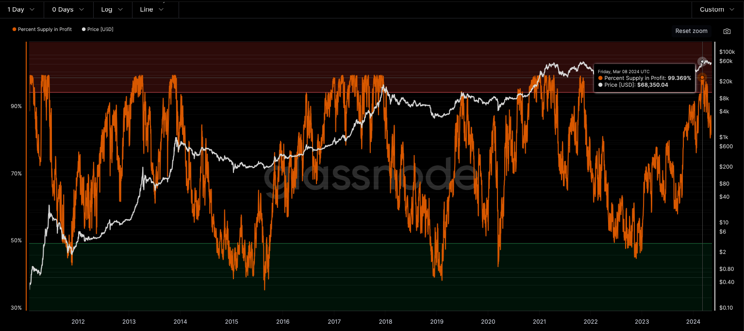
But can you rely solely on this indicator to plan your exit strategy? While it often indicates good times to exit the market or reduce positions, it's not always accurate. As seen in 2020, it can sometimes signal the top too early. For example, on November 10th, 2020, when the supply in profit reached 99%, Bitcoin's price continued to rise significantly afterward.
MVRV Z-Score
The MVRV Z-score divides the difference between the market cap and the realized cap. When the market value, measured as the network valuation by spot price multiplied by supply, is significantly higher than the realized value, it typically signals a market top (red zone); conversely, Z-Scores below 1 signal a time to accumulate.
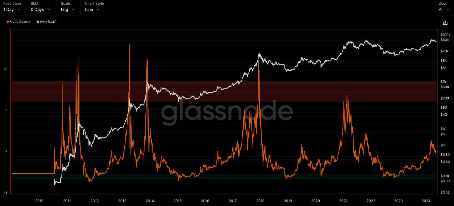
Currently, the score sits at 2.19, still comfortably distant from the danger zone.
Reserve Risk
The MVRV Z-score divides the difference between the market cap and the realized cap. When the market value, measured as the network valuation by spot price multiplied by supply, is significantly higher than the realized value, it typically signals a market top (red zone); conversely, Z-Scores below 1 signal a time to accumulate.
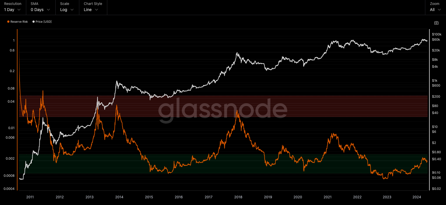
The indicator is still in a green zone and shows that long term holders still holding their BTC.
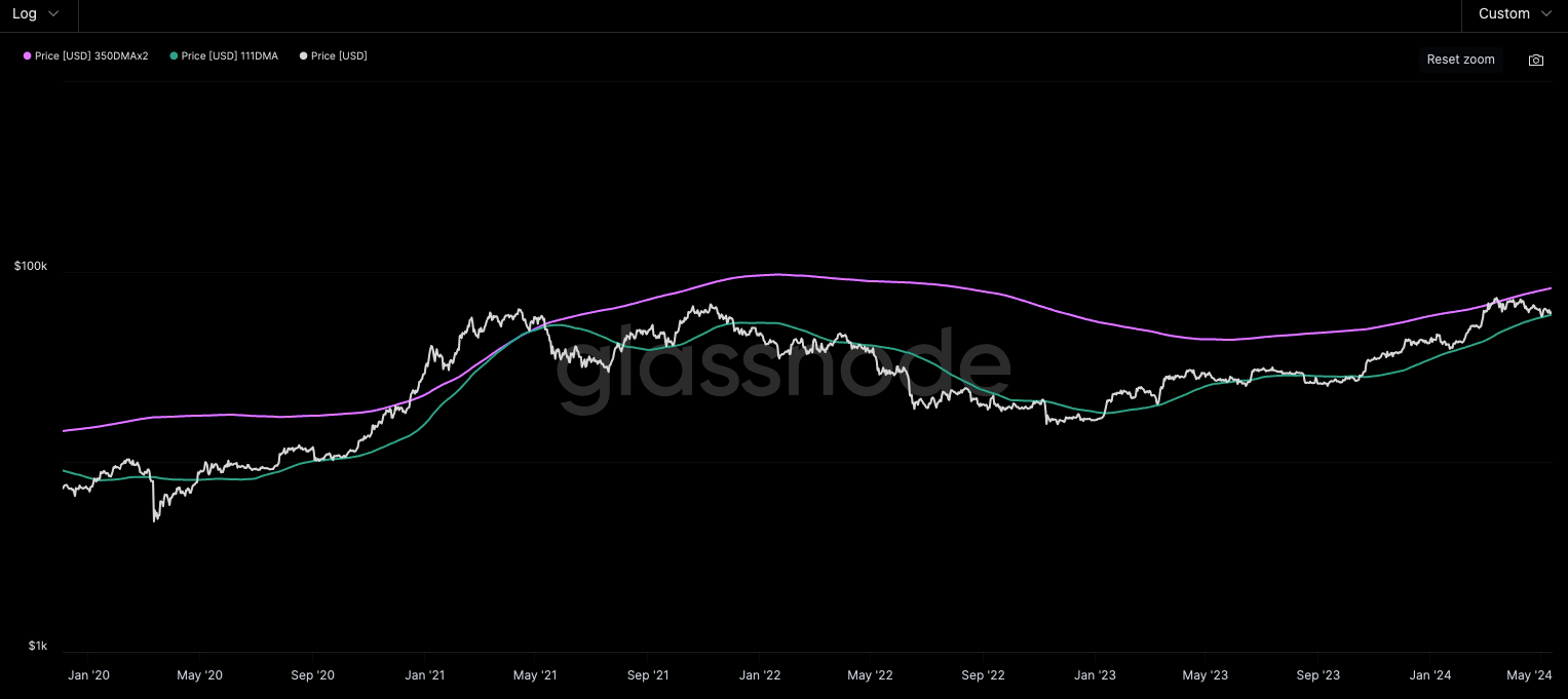
The Pi Cycle Top
The Pi Cycle Top Indicator has historically been effective in picking out the timing of market cycle highs to within 3 days. It achieves this by using the 111-day moving average (111DMA) and a newly created multiple of the 350-day moving average, the 350DMA x 2.
For the past three market cycles, when the 111DMA moves up and crosses the 350DMA x 2 we see that it coincides with the price of Bitcoin peaking. It is also interesting to note that 350 / 111 is 3.153, which is very close to Pi = 3.142. In fact, it is the closest we can get to Pi when dividing 350 by another whole number. It once again demonstrates the cyclical nature of Bitcoin price action over long time frames.
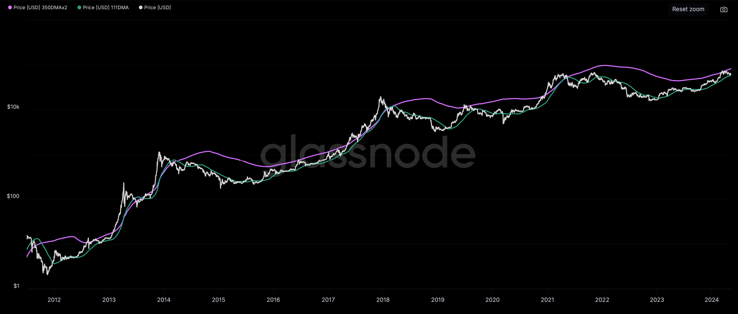
Let's zoom in on the past few years to see where we stand in terms of the Pi Cycle Top Indicator. We can see that we're nowhere near the crossing of the two moving averages. Additionally, the price is currently at the 111 DMA (green), which has historically proven to be a reliable support level in uptrends and resistance in downtrends.
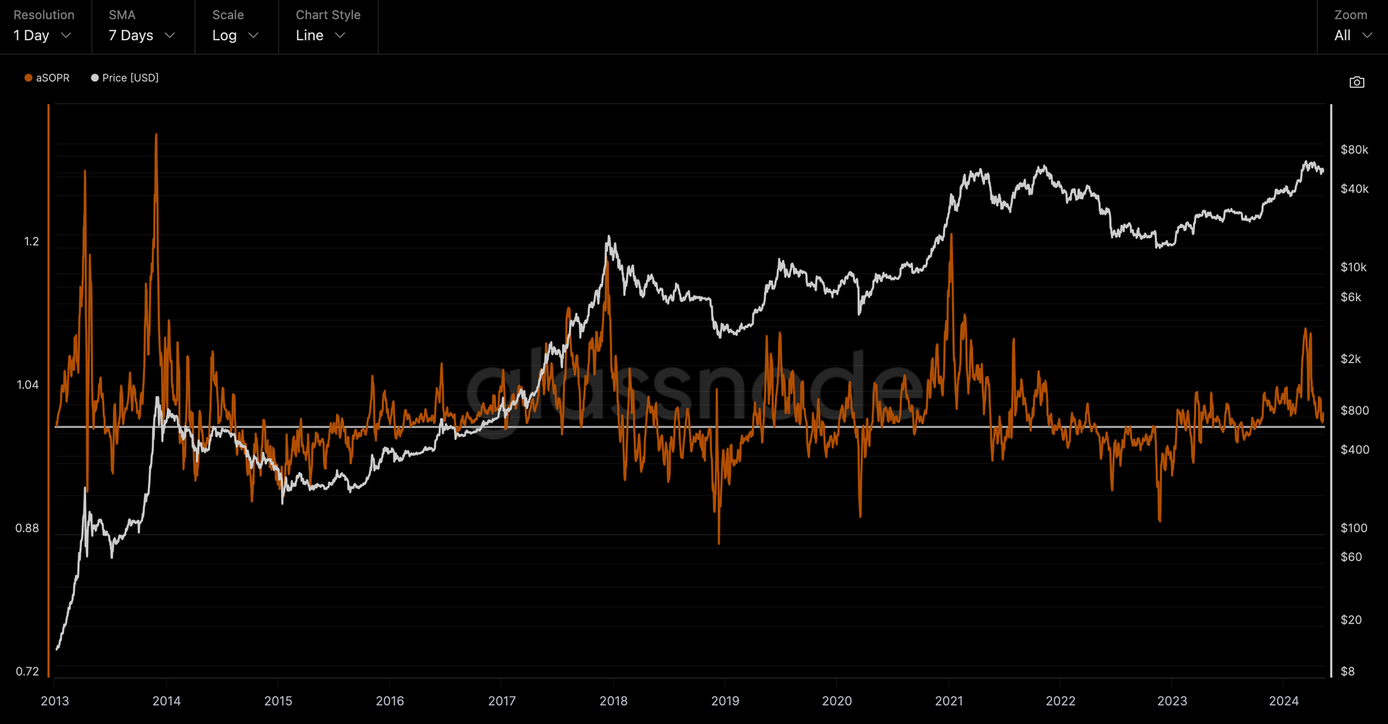
aSOPR
aSOPR, or Adjusted Spent Output Profit Ratio, is a metric that provides insights into whether people are making a profit when they spend their coins. It takes into account factors like aggregate profit and adjusts for spent coins that may not re-enter circulation.
When the aSOPR value is greater than 1, it implies that the coins moved in a certain timescale are, on average, selling at a profit. A value of exactly 1 indicates that coins are being sold at break-even, while a value less than 1 shows that investors are selling at a loss.
The metric, when analyzed alongside the Bitcoin chart, shows a strong correlation of cycle tops with high aSOPR values, and vice versa.
We observe that recently, the aSOPR spiked to a level of 1.1, which in the past aligned with local tops. However, for the cycle all-time high (ATH), the aSOPR tends to show much higher levels – 1.17 in 2012, and 1.21 in 2021 (although BTC continued to rally further after the aSOPR peaked in 2021).
If the cycle repeats as it has in previous cycles, then we can expect both aSOPR and BTC prices to be higher.
On the flip side, the metric is also used to time the bottoms, and extremes below 1 have shown good long-term entry opportunities. Currently, aSOPR is at 1.01, essentially at a neutral level. In a trending market (BTC is in an uptrend on longer time frames), aSOPR close to 1 presents good entry opportunities, just as it did in 2020.
Panic Cancelled
Overall, the Bitcoin on-chain indicators that the market has trusted for years show that key metrics are still not in a danger zone. We're obviously not in the depths of a bear market either, so the perfect entries have been missed. However, based on the fact that the market is not overheated yet, it looks like there's still some juice left.
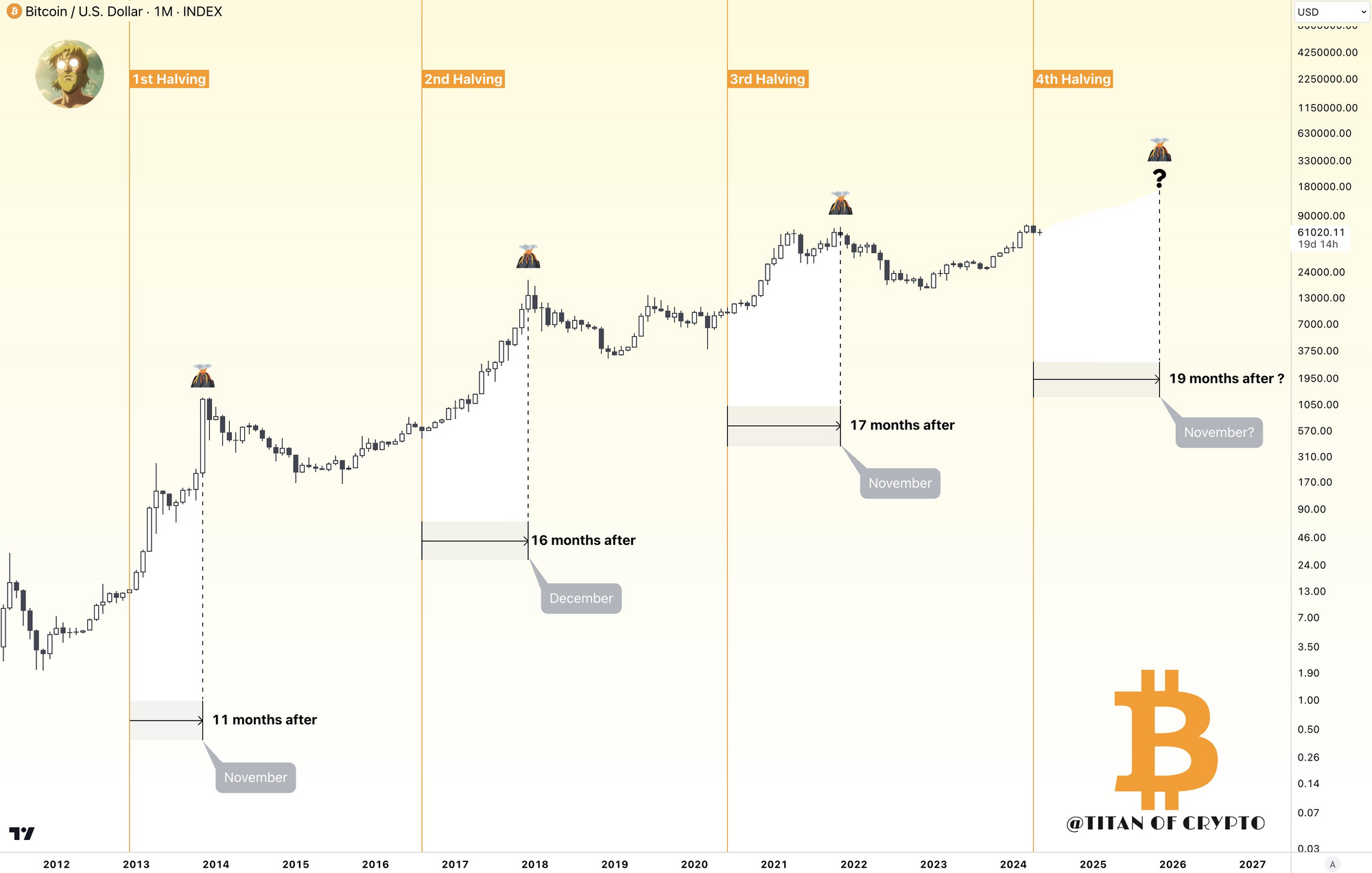
Let's not forget that BTC mining rewards just halved. @Washigorira on X suggests that BTC will peak in November 2025, as BTC typically takes at least 11 months until it peaks. Should this time be different? It looks like the whales think otherwise!
Bitcoin whales purchase $3 billion worth of BTC, signaling a new era. Whales acquire 47,500 BTC in 24 hours, increasing total assets
— RVCrypto (@RvCrypto) May 15, 2024
We are entering a new era pic.twitter.com/1SdE6uWCva